
三栏布局实现方法,比较
三栏布局
左右定宽,中间栏自适应
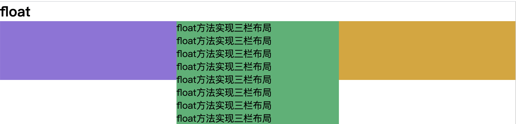
1.float+margin
1 | <style> |
优点:兼容性好
缺点:
- 高度只能固定,否则三栏高度不会根据内容同时变化
- 脱离文档流,后面的元素需要清除浮动
补充:脱离文档流
float属性不为none脱离文档流,不会撑开父元素的高度,它还在父元素中,但是其他元素会为其让开位置,环绕在周围。position:absolute,绝对定位,- 1.相对于父级或更上级
position不是static的元素定位, - 2.如果没有满足上一条件的元素,就相对于根元素定位。
其周围的元素将会忽略它的存在
- 1.相对于父级或更上级
position:fixed,固定定位,相对于根元素定位,完全脱离文档流。position:relative,相对定位,不完全脱离文档流
周围元素不会忽略它的存在,使用 top\left\right\bottom,设置偏移位置时,周围元素会忽略它的位置移动,还是认为它在原来的位置。
周围元素不会忽略它的存在
2.position
1 | <section> |
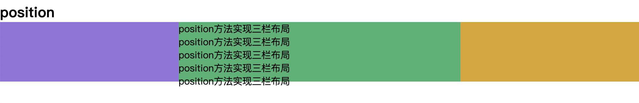
缺点:
- 高度只能固定,否则三栏高度不会根据内容同时变化
- 脱离了文档流,可用性差
3.flexbox
1 | <section> |
缺点:
- 兼容性有问题
优点:
- 三栏高度由内容最高的一栏决定,可以自动一致高

4.table+table-cell
1 | <section> |
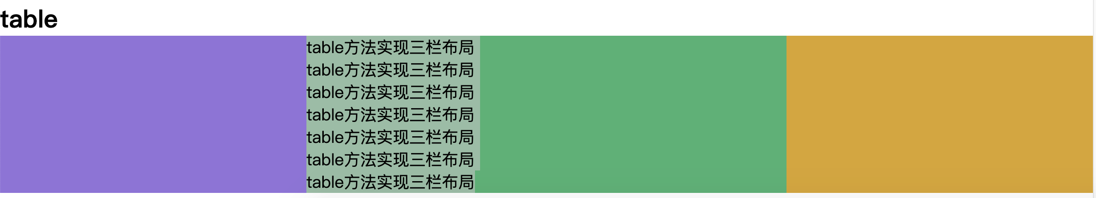
优点:
- 三栏高度由内容最高的一栏决定,可以自动一致高
- 兼容性好
5.Grid(网格布局)
1 | <section> |
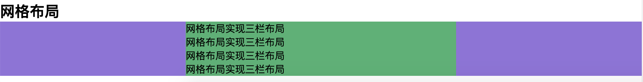
优点:
- 三栏高度由内容最高的一栏决定,可以自动一致高
- 代码简单
缺点:新属性兼容性不好
学习方法:CSS-网格属性
上下栏定高,中间栏自适应
position
1 | <section> |
中间高度自适应,但是内容超出时,需要设置 overflows 属性,否则会影响 body
flexbox
1 | <section> |
中间内容超出时,自动隐藏
grid
1 | <section> |
中间高度按照内容自动撑开,兼容性不好
table
1 | <section> |
- 三栏中,没有内容的话,背景就不会显示出来
- 中间高度按照内容自动撑开