记录几种布局
圣杯布局
html
1 | <div class='container'> |
css
1 | .container { |
效果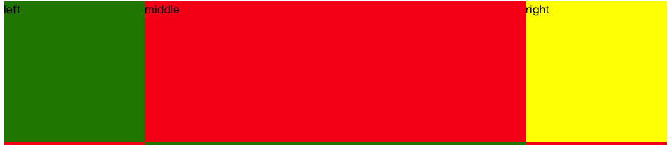
双飞翼布局
html
1 | <div class='container2'> |
css
1 | .middle2 { |
Calc
1 | .center{ |
flex 布局
1 | .container{ |
position
1 | .container{ |

记录几种布局
html
1 | <div class='container'> |
css
1 | .container { |
效果
html
1 | <div class='container2'> |
css
1 | .middle2 { |
1 | .center{ |
1 | .container{ |
1 | .container{ |